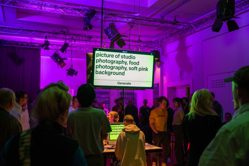
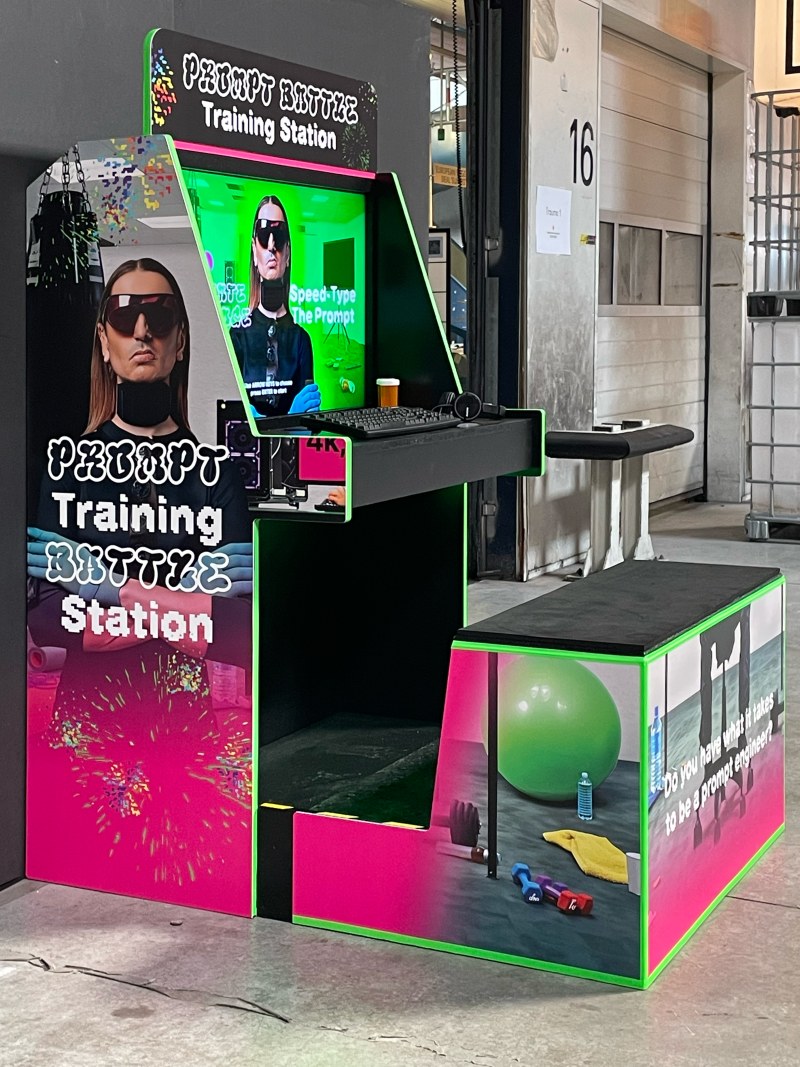
3 Column Layouts – A Different Approach
Chances are good you've already read John Oxton's extensive tutorial A simple introduction to 3 column layouts [offline].
It's easy to follow and offers some good advice, especially for beginners. However there are a few things I would've done differently –
mainly his use of negative margins for swapping columns – and I thought it was worth penning them down. In a nutshell: by adding
one additional divider we'll get rid off any margins at all and make it work in Internet Explorer 5. Plus: We'll be going liquid. Sounds good, doesn't it?
Never float two or more columns to the same side
Never float two or more columns to the same side – for me this is one of the golden rules of CSS. When I want to achieve a 2 column layout, I always float one column to the left, the other one to the right. Of course you could float both columns to the same side and specify a margin in case you need some white-space between them, however there's a reason not to do that: Internet Explorer. Again.
Ever heard of the IE three pixel text-jog? When you float two columns to the same side Internet Explorer will magically add a three pixel space between them. Just like that. Although this IE bug can be hacked, we can simply avoid it by floating the two columns into opposite directions.
But what about the 3 column layout? Well, with three columns to float we're obviously a bit short on directions. That's when the extra divider steps in.
Extra wrapper to the rescue
By wrapping two of the three columns into an extra divider – I usually call that one wrap or wrapper – we make sure that there aren't any dividers on the same level (regarding the document 'tree') that are floating into the same direction and thus no 3 extra pixels are added. In terms of XHTML it looks like that:
<div id="container">
<div id="navigation">nav</div>
<div id="wrapper">
<div id="main-content">main</div>
<div id="sub-content">sub</div>
</div>
</div>
It's your decision which dividers you're putting in the wrapper; it depends on what you want to achieve and what makes best sense regarding semantics. The only thing you should keep in mind is that the divider that's outside the wrapper can not be centered on screen without advanced CSS rules. However let aside this particular case and float:left and float:right will do the job.
Let's float

Above illustration shows how our extra wrapper and some float rules will play together to make what John has nicely illustrated with this graybox layout work in every browser of version 5+ without any (CSS-) hacks.
Translating this into CSS is pretty simple (btw. I'll skip the 'center on screen'-part. John has explained that already):
#container {width:770px;}
#navigation {float:right; width:175px;}
#main-content {float:left; width:400px;}
#subcontent {float:right; width:175px;}
Last but not least the aforementioned wrapper.width = #main-content + #sub-content + 10px margin between them.
#wrapper {float:left; width:585px;}
Make it Liquid
But what if fixed-width isn't trendy anymore? No problem, all we have to do is get rid of all those pixel values and convert them to relative values in percent:
#container {width:100%;}
#navigation {width:22.7%;}
#wrapper {width:76%;}
#main-content {width:68.4%;}
#subcontent {width:30%;}
I should add that those/my percentage values aren't very accurate as they are rounded. If you're going liquid make sure to use more intuitive values like 23%, 70%, etc.
To make things look a bit better I recommend one ore more of the following rules (the pixel values are just examples):
body {padding:0 25px;}
#container {
max-width:1000px; /*doesn't work in IE*/
min-width:450px; /*doesn't work in IE*/
}
Swapping Columns
Our extra wrapper not only avoids the nasty IE three pixel text-jog I've described earlier, it also adds simplicity and elegance to the way we can swap columns. While John uses some tricky negative margins combined with floats the only thing we need to do to swap columns is modifying our floats.
Following are three cases where the code snippets show the float rules that need to be modified in our initial example in order to create the desired effect. It works both for fixed and liquid width.
Sidebars to the left of #main-content
#navigation {float:left;}
#wrapper {float:right;}
#main-content {float:right;}
#sub-content {float:left;}
Shifting the #sub-content to the left
#main-content {float:right;}
#sub-content {float:left;}
Shifting #navigation to the left
#navigation {float:left;}
#wrapper {float:right;}
Personal Preference
As a final note I would like to say that what I've described is just the way I do it; it's a personal preference. If you don't like any extra mark-up you probably won't be happy with the extra wrapper. However if you're looking for a simple and flexible implementation of a 3 column layout that doesn't require CSS-hacks and works in most browsers this could be interesting for you.